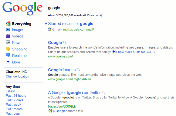
Many users noticed a new interface for Google’s search results pages that tries to better separate results. There’s a lot of space between the results, but that’s not useful when you try to find the best answer for your query.

Huffington Post notices that “the new design looks less cluttered. Rows of text are spaced farther apart and text colors are more muted than previous versions.” TechCrunch calls the new interface “ugly” and less useful because “it actually gives you much less information on the screen. This will require users to do more scrolling and paging through results to find what they’re looking for.”
Links are no longer underlined and one of the experiments uses dotted lines to separate results.
Fortunately. the new interface is still an experiment.
{ Thanks, John, Silviu, James, Ken, Steve and Josh. }