Last week, we showed you some changes to Bing Maps, pointing out some new navigation header changes, and noting that at the time there was nothing on the Bing Maps blog to detail the changes. That changed on Monday, and indeed the Bing Maps blog pointed out the changes we had seen, with a bit more detail.

Now today, another blog post points out even more new stuff for Bing Maps, mostly in the form of refinements to features within the maps themselves. The changes are significant enough that Bing has posted a 9 page pdf entitled “A Guide to Bing Maps: July 2011 Map Style Update”.
One of the main premises pointed out by the Style Update guide is that Bing Maps are made to have data presented on top of them:
Bing Maps are rarely seen in isolation. In fact, roughly four out of five people who see a Bing Map on any given day will see it with data plotted on top of it (whether that data is a route, pushpins, traffic information, or something else).
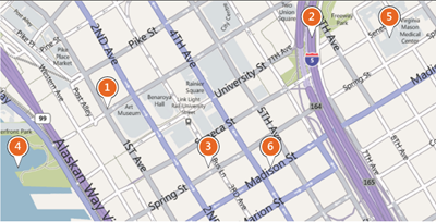
The new maps, rolling out this month, show 1) Casing for all roads, 2) better differentiation of main and secondary roads, 3) New one way arrows, 4) a new deeper blue for water, especially useful for color-blind users, 5) different shades of gray for roads and buildings, and 6) more legible type:

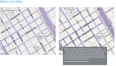
Here’s a side by side view of the old and new map styles showing the changes:

In addition, the document points out changes to “shields”, or landmark and road names, transit icons, etc.; changing data depending on which of the 18 zoom levels you’re on; scalable type for long road names; changing data based on density; country specific road shields, new styles for unpaved, park, and forest service roads, and continued emphasis on Bing features like shopping mall maps.