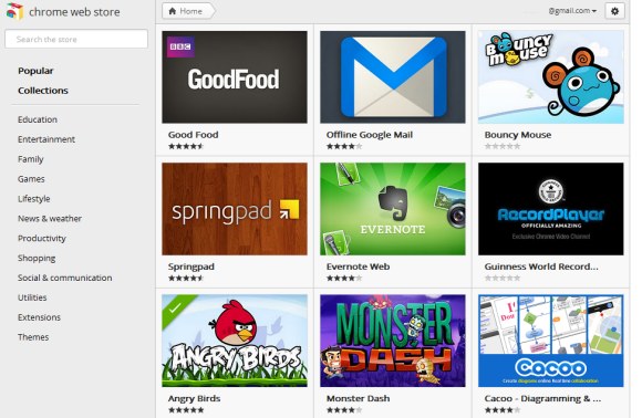
As promised, Google’s Chrome Web Store has a new interface that uses promotional images and larger screenshots, opens extension pages in overlays and makes it easier to install extensions, themes and apps. Another change is that the new version is a lot faster as it uses AJAX to load extension pages. Infinite scrolling replaces pagination, so you no longer have to click “next”.
“Promotional images are your chance to capture users’ attention and entice them to learn more. Don’t just use a screenshot; your images should primarily communicate the brand,” suggests Google in the documentation.


Unfortunately, search results are now terrible, as you can see in the screenshot above. When searching for [Gmail], from the top 10 search results, only 2 extensions and apps are relevant. The top search result for [YouTube] is AdBlock, while the first result for [Google Docs] is FB Photo Zoom. The search algorithm is not good enough and Google made things worse by mixing the results for extensions and apps.
The new interface is only available in Chrome and Chromium, so you can go to https://chrome.google.com/webstore in a different browser to see the old interface.


{ Thanks, Costin and Jérémy. }