Chrome’s navigation error pages have a new look: a simplified design optimized for mobile, with bigger text, smaller search boxes and less information.

They usually show up if a site is down or the web address can’t be found. “Google Chrome can show suggestions for the page you were trying to reach, if it is unable to connect to the web address. Instead of a cryptic error message, you’ll see suggestions to navigate to other parts of the website or to search for the page with Google. Often the webpage can’t be found because it’s temporarily down. To check if this is the issue, try opening the page in other browsers, such as Firefox or Internet Explorer,” suggests Google.
Chrome’s error pages are powered by a web service, so that’s the reason why the new design is available in old Chrome releases, in Chrome’s mobile apps and more. Here’s an example: http://linkhelp.clients.google.com/tbproxy/lh/fixurl?sourceid=chrome&url=www.gogle.com.


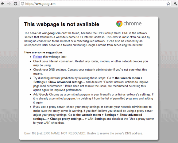
Here’s the old layout (Creative Commons screenshot from Paul Jacobson):

Chrome has recently updated the “webpage is not available” error page. Here’s the old one:

… and the new one, which only shows the long list of suggestions if you click “more”:


{ Thanks, Michael and Sushubh. }
Google Operating System