Google launched a new interface for Google Image Search which replaces pagination with infinite scrolling, hides the information about the results until you mouse over an image, shows bigger images and uses space more efficiently. When you click on a results, Google shows a larger thumbnail on top of the web page that included the image.


Google says that the new layout is more dense, you can get up to 1,000 images when you scroll and you can scroll using keyboard shortcuts like Page Down and Page Up. Google still shows page numbers “so you don’t lose track of where you are”.
Another new feature is image search ads that will replace the text ads that are displayed at the moment in Google Image Search. “This ad format combines an image with text, offering richer, more relevant advertising on Google Images search results pages.”
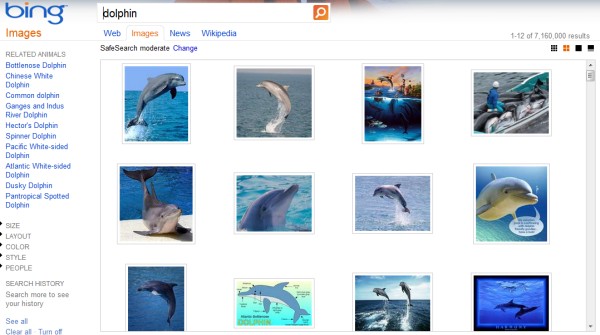
It’s interesting to see that Google reintroduces two features previously tested without success: image ads and a simplified interface that hides useful information about images. Infinite scrolling was one of the distinctive features of Bing Image Search and Windows Live Image Search.
Google Image Search’s new interface makes it easier to scroll through results, but I don’t think a regular user will look at hundreds of images. Google’s goal is to find relevant results, so showing too many images is overwhelming and a lot of the images aren’t useful. Hiding information about the image’s size, the domain that includes the image and no longer showing a snippet from the page is a purely aesthetic decision. Sometimes it’s useful to know if an image is large, if it’s included by a site you trust and even the filename could offer relevant information. Google offers a “show sizes” option in the sidebar, but it’s not enough.
Old interface:

New interface:

Bing:

If you don’t see the new interface yet, try a different browser. Google says that only 10% of the users can see the new UI and it will be available for everyone in the coming days.