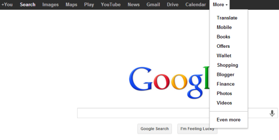
After so many posts about Google’s new navigation menu, it looks like this feature will roll out to everyone in the coming weeks. It’s time to say goodbye to the black navigation bar, which didn’t look that great, but it was always at the top of almost any Google service, so you could quickly navigate to other Google sites.
“We’ll be rolling out this new feature in the next few weeks…stay tuned,” says Justine Rivero, from Google. “The new design has been under testing for over half a year, with reports coming in as early as February 2013 regarding the new grid menu,” informs Google+ Daily.

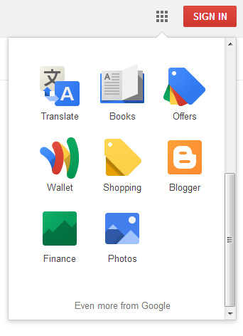
The new grid icon shows a list of 9 popular Google services (Google+, Web Search, YouTube, Maps, Play, News, Gmail, Drive, Calendar) and you can click “more” or scroll down to see 8 other services (Translate, Books, Offers, Wallet, Shopping, Blogger, Finance and Google+ Photos). The services that are missing: Google Image Search, Google Mobile and Google Video Search (they are available in the black navigation bar).
The new navigation menu looks just like the Chrome app launcher or the apps section of the Google Search app for iOS. It includes icons for each Google service, so that they look more like real apps.
For the first time, YouTube will have a Google navigation menu and the interface will be more consistent.
It will be interesting to see if the app launcher will be more successful than a similar interface launched in 2011 and removed after a few months. You had to click a small arrow next to the Google logo to see a huge menu that included a lot of Google services. The menu was hidden by default, so it wasn’t easy to find (Google’s homepage expanded it, but that didn’t save the short-lived menu).

{ via Google+ Daily }
Google Operating System