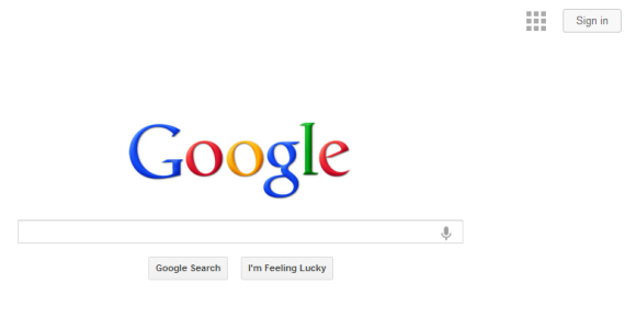
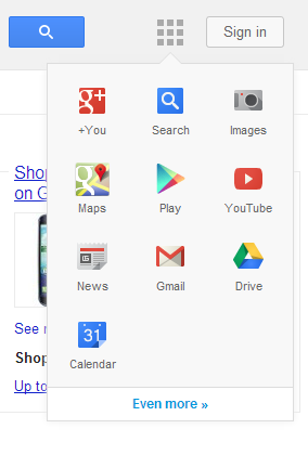
Google tests a new navigation menu that’s more compact and includes fewer services. You need to click an icon that’s placed next to the “sign in” button and you can access popular services like Google Maps, YouTube, Gmail, Google Drive and Google Calendar. For some reason, the menu includes a redundant icon for Google Search even when you’re using Google’s search engine.
The interface seems to be inspired by Chrome’s app launcher, uses less space, but it’s not very obvious. It’s like a new version of the hidden navigation menu that was launched back in 2011 and removed after a few weeks.


{ Thanks, Maurice. }