After many weeks of testing, Google finally updated the homepage and search results pages. The changes aren’t so radical, but they’re still significant: there’s a black navigation bar, two updated buttons for “Google Search” and “I’m Feeling Lucky”, while the corporate links are moved to the bottom of the page.

Google says that this is just a small step from a redesign that will affect many other services. “The new Google experience that we’ve begun working toward is founded on three key design principles: focus, elasticity and effortlessness. (…) With the design changes in the coming weeks and months, we’re bringing forward the stuff that matters to you and getting all the other clutter out of your way. Even simple changes, like using bolder colors for actionable buttons or hiding navigation buttons until they’re actually needed, can help you better focus on only what you need at the moment.”
The new navigation bar seems to draw unnecessary attention and some find it distracting, so it’s not clear how it helps you “better focus on only what you need at the moment”. Google’s black bar is used in Google+, so it’s likely that it will include other social features in the future.
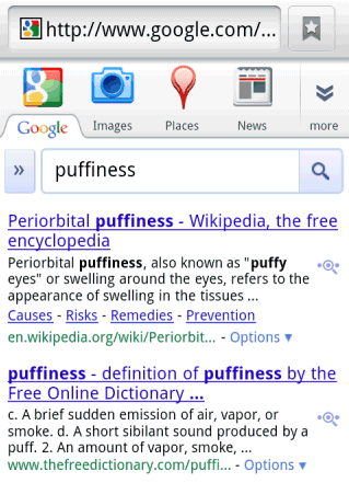
Google also says that new design is flexible so that it can be used in the desktop interface, the smartphone interface, the tablet interface and even the interface for smart TVs. “The new design will soon allow you to seamlessly transition from one device to another and have a consistent visual experience.” At the moment, I’m seeing a new mobile interface that doesn’t have too much in common with the desktop interface:


While the interface continues to be simple and utilitarian, Google wants to use HTML5, WebGL and other new technologies to make Google’s apps more powerful and better looking. “Our design philosophy is to combine power with simplicity. We want to keep our look simple and clean, but behind the seemingly simple design, use new technologies like HTML5, WebGL and the latest, fastest browsers to make sure you have all the power of the web behind you,” explains Google.
Google promises to improve the user interface in Gmail in the coming months, but I think that many other apps will be redesigned and the main goal is to integrate with Google+. If you want a preview of Google’s new interfaces, take a look at the Google+ project. Here’s, for example, the new Google Maps design:

It’s interesting to see that Google Maps added the label-less blue button from Google+, but Google Search still uses the regular button.
{ Thanks, Nikita. }