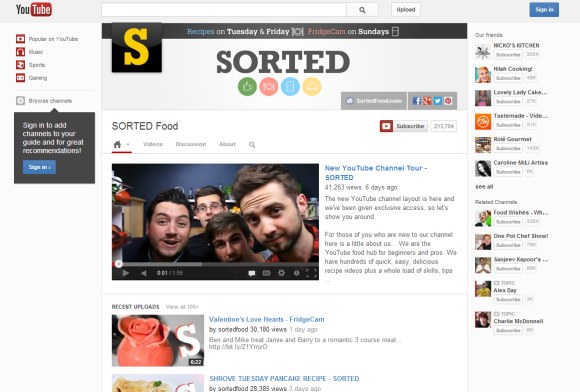
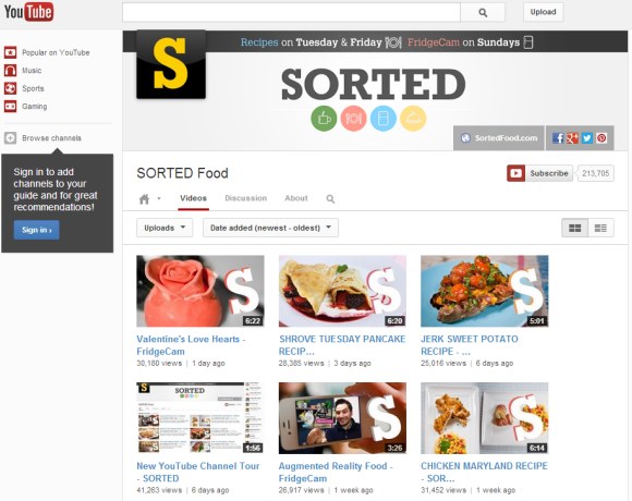
YouTube tests a new interface for channels. For now, the updated layout is only available for a few channels like Sorted Food, iJustine, The Pet Collective and YouTube’s own channel, but it will soon be enabled YouTube-wide.
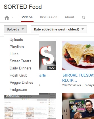
What are the changes? The persistent left sidebar and the list of featured channels limit the channel’s real estate, but make the interface more consistent. Most of the features from the old interface are still available, but they’re more difficult to find. For example, to find the “feed” view, you need to click the arrow next to the home icon and click “feed”. The list of playlists, the featured playlists and the list of likes are buried in a drop-down. There’s also a new “about” section that shows the channel description, the number of subscribers and the video views, which is used to be placed in the right sidebar. The search box is only displayed when you click the new search icon.
The channel trailer replaces the featured video for non-subscribers. “You can show a trailer that will only appear to viewers who aren’t already subscribed to your channel. This is your chance to let visitors know what your channel is all about and tell them why they should subscribe.”


{ Thanks, Sterling. }