Last month, I reported that YouTube tested a new interface for the homepage. Now YouTube experiments with a slightly different version of the UI. There are some useful new features, but also many poor choices.
The new experiment puts all the recommended videos in the activity stream and you can no longer restrict the stream to uploads. If you click the “my subscription” link from the sidebar, you can hide the recommendations. YouTube shows too many recommended videos and they’re not always relevant.
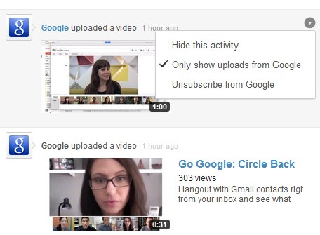
The right sidebar only shows recommended channels and topics instead of the list of video recommendations. Another change is that you can mouse over an item from the activity stream, click the arrow icon and access options like: “hide this activity”, “unsubscribe”, “only show uploads from this channel”. There are also some new filtering option for subscriptions: click the arrow next to the search box from the left sidebar and you can sort the channels by name, new activity or relevance (the default option).


To try the new experiment, check the updated guide from this post.