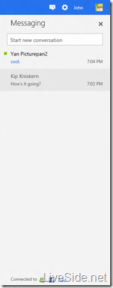
By now you would’ve all had your chance to take a look at the new Metro-style Microsoft account website, and if you haven’t checked it out already, we’ve also posted screenshots of the new Metro-style Hotmail and SkyDrive. Whilst the design looks elegant and simplistic, if you have a wide-screen monitor, you might come to realize that there’s just a bit too much white space towards the right side of the screen. Fear not, because this space is actually used for the new Metro-style Web Messenger sidebar (or more correctly, Messaging sidebar), which can be toggled on and off using a simple switch on the header. Check it out below:
![]()
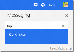
As you can see in the screenshots above, the new Messaging sidebar looks very much like the Windows 8 Messaging app when snapped to the side. You can start a new conversation by simply searching for a contact’s name in the search box:
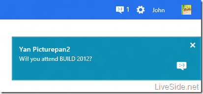
When you receive a new IM message, you will get a pop-up notification on the top-right corner very much like the ones you see on Windows 8, as shown below:
To change your presence (which is now as simple as Available or Invisible), simple click on your display picture on the top-right corner on the top bar, where you can also toggle other IM networks such as Facebook Chat on or off:
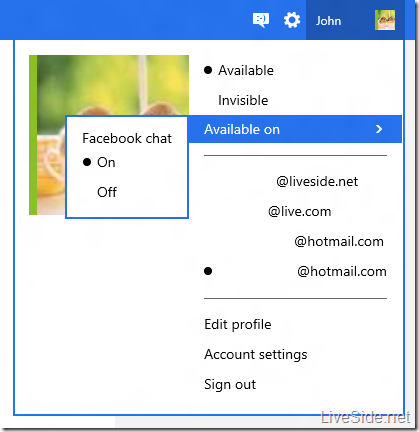
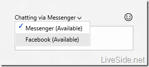
If your contact is available on multiple networks, similar to the current version, you can also select which network you’d like to chat on:
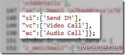
Currently, features of the new Messaging is very similar to the current Web Messenger. However, we found clues indicating that the Messaging experience will soon support audio and video calls, as shown in the codes below:
To try it out for yourself, simply visit https://account.live.com/WebIM.svc (you may have to sign in, then re-type the address in your browser again), then click on the Messaging icon on the top bar. Let us know what you think of the new Messaging experience in the comments below!