Microsoft has just unveiled their new Bing logo, aimed to integrate the “One Microsoft” vision both from a product perspective and visually. We’ve actually caught a glimpse of this logo back in April, when Todd Simmons, Creative Director at Wolff Olins, showed off some early prototypes of logo redesigns for Microsoft. You can check out the final logo below:
The wordmark now uses the Segoe typeface, which is now consistent with the rest of Microsoft brandings. The colour palette Orange 124 was chosen to emphasise “clarity, confidence and warmth”, according to the Bing blog post. You can read more about the thinking behind the new logo by reading Scott Erickson, Senior Director of Brand and Creative division, blog post here.
Improved Snapshots and Sidebar
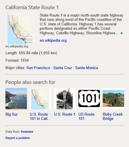
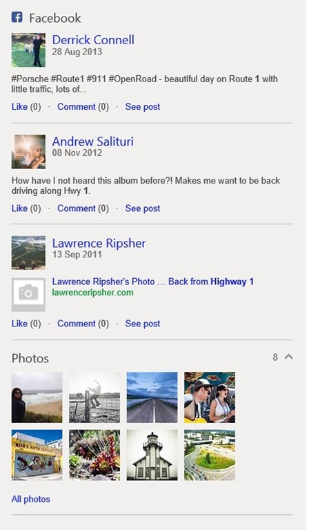
Last year, the Bing team introduced the Snapshot and Sidebar to the search results interface. Snapshot showed what “Bing knows” about a person, place or thing, and the Sidebar showed what your “Friends know” from various social networks. In the new update, Microsoft has combined the two sources of knowledge together to provide users with all the supporting context they’ll need for any given query.
Page Zero
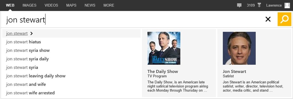
Microsoft introduced a new function in Bing that helps a user get an answer or take an action before they even see the first results page. This is done by displaying the key tasks associated with the query while the user is typing. Below is how the Bing team describes this new feature:
Page Zero can help users find what they are looking for faster through “intelligent disambiguation”. This is another way of saying if we understand there are two similarly named people or things, we give you the choice of picking the one you want for the most relevant results. For example, if you’re searching for “jon stewart” You could be talking about the show or the host. So here we present you with a choice right in the search box.
We’ll continue to improve our intent understanding based on real-time data so our action tiles will actually change over time based on what actions are most relevant to that entity. For example, for a query like the publication El Tiempo, we’ll show deep links into the site so you can navigate directly into the publication. For something like the query for United Airlines, we will show the most common actions like “Check in” and “Flight Status”. We think the time people will save using Page Zero instead of navigating a search results page will be significant.
Pole Position
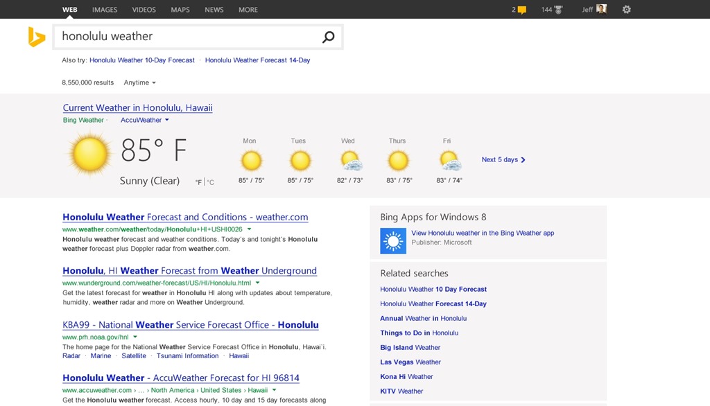
Another new function in Bing is “Pole Position”, which is a new surface area at the top of the page that is displayed for what Microsoft calls “high confidence” query results, showing some of the structured data and entities that Bing knows about the topic and display them in an easier-to-view format. Below is how the Bing team describes it:
When we know that someone wants images of a celebrity, is looking for a specific fact or needs a detailed view of the weather in a particular city, we now provide a much larger answer beautifully integrated at the top of the page. These larger format answers help people find the best answer for their question. This space will be rapidly evolving to enable users to take an action or dig deeper into that topic. To create this feature, we’ve leveraged all our experience with delivering structured data and entities in our Snapshot over the past year. We’re excited about being able to deliver a compelling experience when we are sure, yet dial back gracefully when variety should be emphasized.
Better mobile and touch support
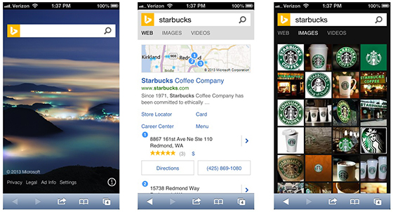
Bing has also been overhauled and rewritten to support a new responsive design that adapts across PC, tablet, and phone. The Bing team indicates that “part of this focus on mobile and tablet devices means integrating touch into our experiences and we’ve introduced a number of capabilities to allow for more rapid refinements in the future.”
You can try out the new Bing experience now by going to http://www.bing.com/new. What do you think of the new redesign and the logo? Let us know in the comments below!
