With Bing, we’re all guinea pigs, and thanks to our readers (this time @TheRomit, thanks!), we get to sneak a peek at what may be coming for Bing in the coming months through various “flight tests” conducted on the service for some Bing users.
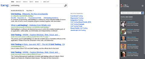
This time it’s a number of changes to the Bing social sidebar, where your Twitter and Facebook friends and others (like experts from places like Quora) show up. Here’s what that sidebar looks like today, in a screenshot we just took:

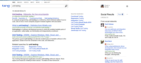
But as @TheRomit noticed, Bing is trying out some alternatives to the dark theme. Here’s what he was able to capture:

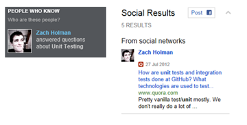
Taking a closer look, we can see that the new version has not only lost the dark background, but added a number of features, as well:

![]() As you can see, instead of the generic “___ answered questions”, we get an icon from the source (in this case, Quora), and the date, linked title, source url, and a bit of text about each answer. Much more useful.
As you can see, instead of the generic “___ answered questions”, we get an icon from the source (in this case, Quora), and the date, linked title, source url, and a bit of text about each answer. Much more useful.
Are you seeing these changes? Any others? And what do you think about the new no-background theme? (we’d like to see something maybe halfway in between, lighter, but not gone).
And of course the bigger question is: do you find the social sidebar useful? Do you use it at all, or is it just noise on the page?