In advance of one of the most significant waves of product launches in Microsoft’s history, Microsoft is unveiling a new logo for the company.

Microsoft Chief Marketing Officer Chris Capossela opens the Microsoft Store in Boston, which dons the company’s new logo, on Aug. 23, 2012.
![]()
Click logo for larger view or here for Print quality
The logo has two components: the logotype and the symbol. For the logotype, we are using the Segoe font which is the same font we use in our products as well as our marketing communications. The symbol is important in a world of digital motion (as demonstrated in the video above.) The symbol’s squares of color are intended to express the company’s diverse portfolio of products.![]()
Starting today, you’ll see the new Microsoft logo being used prominently. It will be used on Microsoft.com – the 10th most visited website in the world. It is in three of our Microsoft retail stores today (Boston, Seattle’s University Village and Bellevue, Wash.) and will shine brightly in all our stores over the next few months. It will sign off all of our television ads globally. And it will support our products across various forms of marketing. Fully implementing a change like this takes time, so there may be other instances where you will see the old logo being used for some time.
Nice logo overview from Seattle Times

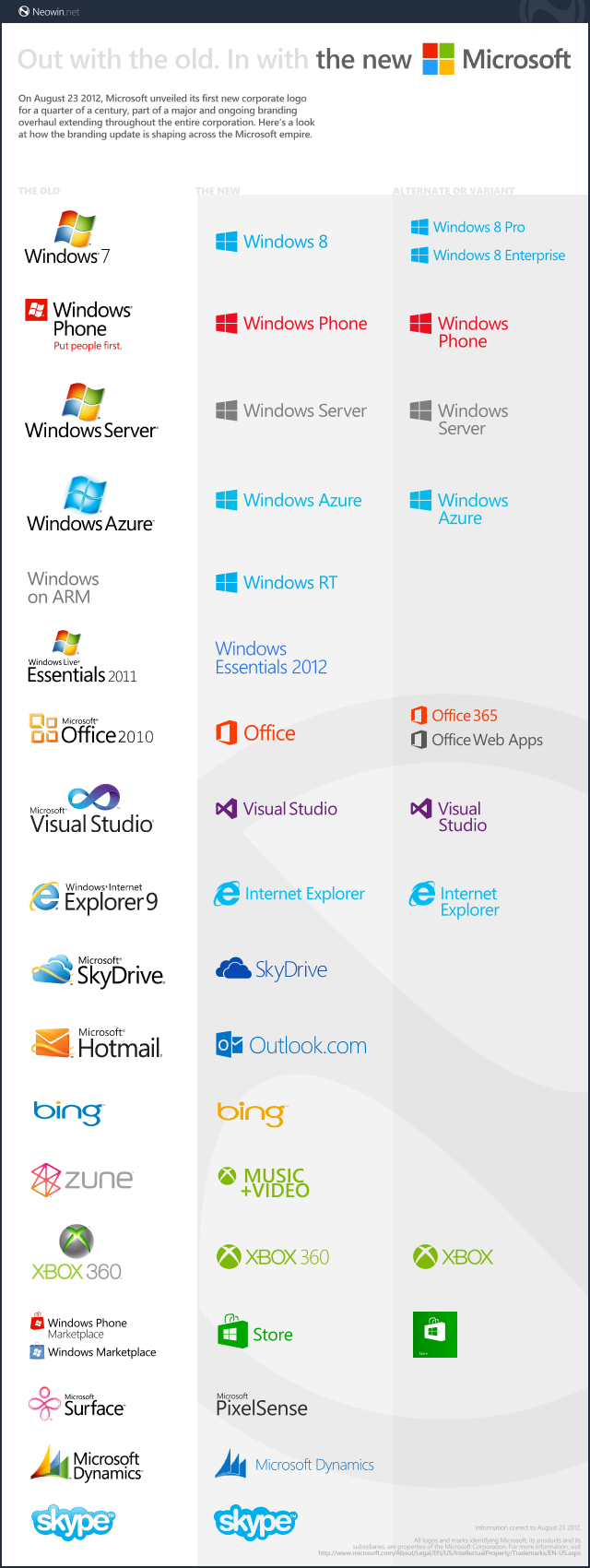
Neowin crested a nice graphic with all the new logos