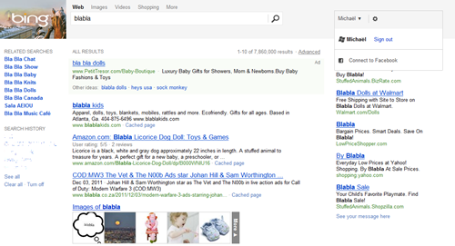
Looks like the folks at Bing are back at it again, testing new versions of the UI, while not saying much about them or how (or even when) the changes will roll out more broadly.
This latest look seems to feature more of a blocky, “Metro style” interface, and quite a bit cleaner than the current look (well current to us, we’re not even sure that the last round of changes ever fully rolled out).
Here’s one look, from reader Michaël Bessard:

Compare that to our current look:

As you can see, the current double navigation (at the top, and again under the search bar), which we find quite confusing, is gone, and the “Wave 3” style header is gone, too, replaced by a block image on the left, a simple gray background, and a more “Metro” looking drop down profile box, in monochrome black instead of the current color version.
Michaël reports on a few details of his new Bing experience:
Unless I’ve completely missed something, the Bing header just changed for me, but only for the ‘Web’ tab.
Whenever I click elsewhere (Images, Videos, Travel, Maps, Shopping, etc.), I go back to the ‘old’ interface.
I haven’t really noticed anything different except that the fluid transitions with the rest of Bing obviously don’t work and when I scroll down, the bar does NOT stay at the top. Also it just goes to the top and reloads only the results section of the page when I click next or previous page, even though I don’t remember if that was the case before or not… :/
Otherwhise, it’s way cleaner, it feels less crowded and takes the same height exactly as the older one.
Reader Nikhil Jain also spotted another example of the new look:

(update: @kit_y on Twitter spotted it too)
What version of the Bing UI are you seeing? And which do you like best?