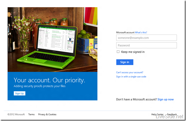
So we’ve shown you exclusive screenshots of the new Microsoft account website, as well as the new Profile page, both in their Metro-style glory. This time we were able to discover a new Microsoft account login screen, which clearly shows the rebranding of “Microsoft account” and also in a very Metro look. However, what’s interesting is not the login screen itself, but the “placeholder” images that was shown on the login screen. Check it out below:

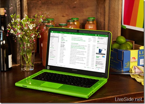
Yes, the placeholder images revealed the interface for the new and upcoming Hotmail, also showing a very Metro-fied look similar to the Profile page we’ve shown earlier. We managed to obtain the original image, which shows a closer look at the new Hotmail:

As you can see, the new Hotmail website also features the minimalistic header, and its color will vary according to the service (for example, SkyDrive will have a blue header, whilst Hotmail is currently green, as shown above, but may or may not change to the teal color consistent with the Mail app in Windows 8 Release Preview). Towards the left is the name and logo of the service, and clicking on it will bring down the Metro-style menu for navigating between Hotmail, People, Calendar, and SkyDrive. Menu items for the actual service, such as composing a new email and organising emails, will be shown in the middle part of the header bar. Towards the right are buttons to bring up Messaging (WebIM), Settings, and your Microsoft account info.
We’ve heard that the new Hotmail interface will be “fast, fluid, and intuitive”, and fully optimized for touch-based devices as well as traditional mouse and keyboard. We’ve also heard that the new Hotmail will feature “a new style of advertising that is not flashy or distracting”, but exactly what that means will remain to be seen.
So what do you think about Hotmail’s new look? Let us know in the comments below, and be sure to check back at LiveSide as we bring you the latest news on the next version of Hotmail, SkyDrive, and more. Stay tuned!