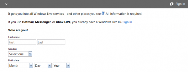
One of the most popular suggestions we’ve heard from our readers on how to improve Windows Live is to overhaul its web service’s user interface, and bring it more in-line with the Metro UI used in Windows Phone, Windows 8 and latest Xbox 360 dashboard update. Well it appears that Microsoft has definitely heard the feedback, and thanks to a tip from LiveSide reader Scott, Brazilian website Tecnoblog.net had discovered what seems to be the next UI for Windows Live web properties, which just came online over the Easter weekend. Check out our exclusive screenshots, in English, below:

Clicking on the arrow in the minimalistic header will bring you a very Metro-styled menu, showing navigation to Hotmail, People, Calendar and SkyDrive:

In fact, we noticed on Microsoft Careers that the company is hiring a new UX Designer to design the “next generation” of Windows Live web services:
The Microsoft Windows User Experience team in Silicon Valley is seeking exceptional interaction designers to make the Windows Live web services, including Hotmail and SkyDrive, more powerful, engaging, and rewarding to use. This is an opportunity to reinvent how people interact with computers, to turn new technology into positive user experiences, and to deliver a product that reaches millions of customers. If you are inspired by these plans, then this is the team for you.
As a UX Designer, you will work alongside some of the world’s most talented product designers, usability specialists, and software developers to build the next generation of the Windows Live web services. You will help set the vision for future experiences, serving as a user advocate to ensure the highest level of usability, desirability and customer satisfaction.
We believe the screenshots above is in its infant stages, and more changes will follow. But this is definitely good sign that Microsoft is bring its Metro-style interface to Windows Live web services like Hotmail and SkyDrive. The UI is also touch-friendly too, meaning that it will work on tablets without having to pinch-and-zoom to find what you’re looking for. How do you like the new UI? Let us know in the comments below.