So yesterday we just posted the first screenshot leak of the Metro-style Hotmail, today more screenshots from the service has leaked. German website WinFuture.de managed to get hold of several clear screenshots of the new Metro-style Hotmail, clearly showing how the interface looks like (in German). Check them out below:
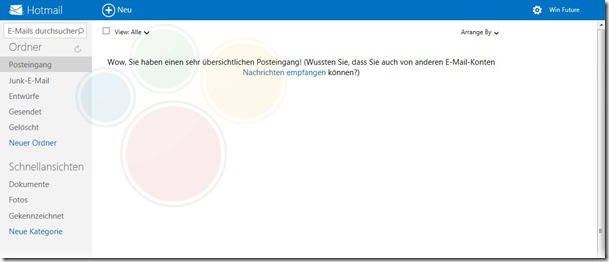
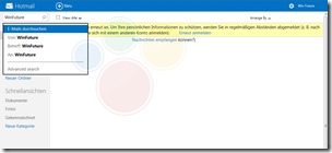
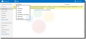
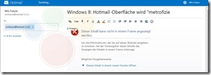
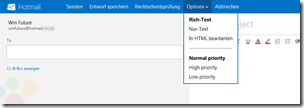
As you can see, the header of the new Metro-styled Hotmail seems to have turned blue, instead of green as shown yesterday, but we believe that’s supposed to change. The menu options such as composing new e-mail, or formatting options, has been moved to the header. The top-left corner will now feature the search box, and this will be consistent throughout Hotmail, SkyDrive, People and Calendar. Unfortunately, the right-hand bar was not loaded in the screenshots, and hence we’re unable to see exactly what it will show there.
How do you like the new interface? Let us know in the comments below!